Flat design is not going anywhere. If it was smoking in 2014, it’s definitely on fire now in 2015. But, what are the rules of flat design? What do you need to know about this trend to make it work for your design? And, most importantly, how do you set yourself apart from the sea of similarity?
Let’s dive right in with a short and sweet definition of flat design.
What is Flat Design?
Flat design is the opposite of 3D. It’s also the opposite of realism. There is no depth, no texture, no gradients, or drop shadows* in flat design. It is simple, often but not necessarily cartoonish, and a Chuck Norris dropkick in the face to skeuomorphism. Skeuomorphism is design that mimics 3D on a 2D surface. Here’s an example:
![]()
Wait a Minute, I’ve Seen Flat Design with Shadows
There’s flat design, and there’s almost flat design. Almost flat design has the trademark flat appearance, but with the stylized addition of shadows for a cool effect. These shadows are not drop shadows that give the faux appearance of depth. Instead, this effect is called a long shadow. Most of the time, long shadows jet out at 45 degree angles.
Although Almost flat design is almost flat design, the following commandments will apply to both.
1.Understand Your Visitor
Will your visitor get flat design? Although it’s simple, some designs are too simple, and some visitors may have a hard time knowing where to click. This is why it’s so important to understand your visitor and tailor your site with that one individual in mind. Yes, your design may be so beautiful, but if your visitor doesn’t know where to click to make a purchase, it’s not a functional design.
Instead, know who you’re marketing to, and which flat elements would be best employed. This leads us to the next point:
2.It’s Not All or Nothing
There’s a tendency in web design to embrace one trend and forsake all others. It doesn’t have to be this way. You can incorporate bits and pieces of flat style into your website without it being a deadly sin. If you love flat icons but don’t want to go fully flat, that’s perfectly okay.
3.Colors are Important
Yes, color is important in all web design, but even more so in flat design. Because you can’t rely on drop shadows or glassy surfaces, you’ll depend on colors to indicate interactive elements in your design.
Colors also set the mood of your design. Is it retro, is it modern, is it playful, is it serious? Colors can explain it without you having to say a word.
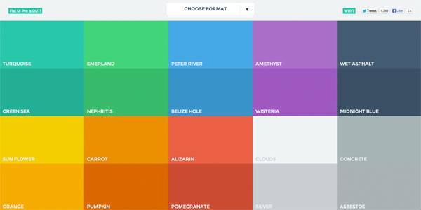
Color matching is trickier in flat design. Color harmony can make or break your design because there’s no skeuomorphic details to fall back on. Two good resources are Flat UI Colors and Flat UI Color Picker.
4.Less is More
Leave white space to make your flat design pop off the screen. Every space shouldn’t be busy with color, text, buttons, and ideas. Give the eye space to imagine boundaries and transitions.
5.Focus on Typography
Flat design skews toward minimalism, which means less emphasis on imagery, and more on text. This design style is great if you love typography. Take a look at a site like Flat UI Typography (gotta love these easy to remember domain names) for examples of typography that just works on flat design. And then head over to DaFont or Font Squirrel to download fonts that may work for your design.
6.Translate to Offline
If you do business offline, bring flat design into real life. Make flat design prominent on business cards, flyers, brochures, stationery, invoices. Keep a consistent brand identity especially when you go flat.
7.Make it Useable
There used to be a time when flat design was not considered user friendly. Actually, a lot of people still hold that belief. But that doesn’t have to be true. Make sure that users know where to click. How? By telling them click here. Use words, or animation, to trigger engagement.
8.Shape Shift
It’s flat design, not card design, so don’t just limit yourself to rectangles. All shapes are fair game when it comes to flat design.
9.Embrace Ghost Buttons
Ghost buttons, or those completely transparent buttons with a thick border, are an exciting part of flat design. Don’t feel like you have to color in every button to adhere to the rules of flat design. Instead, it would be awesome to implement a hover effect with a ghost button to indicate action.
10.Be Creative
More than anything, dare to be different. Be the next trendsetter. Take what works in flat design and modify it to suit the needs of your audience and your aesthetic.
The Bottom Line
Use flat design to elevate your website, but don’t be a slave to it.