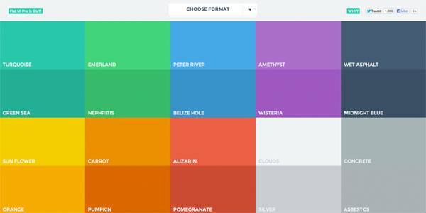
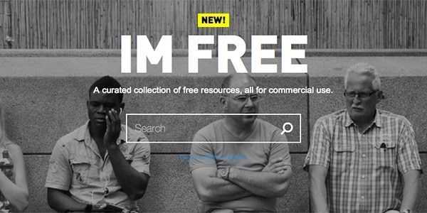
In 2014, the biggest web design trends included: grid layouts, flat design, background videos, and the increasing capabilities of HTML5 APIs.
So which trends, technologies and techniques will define 2015? net magazine set out to uncover them by asking 20 of the web’s brightest designers, developers and thinkers.
Here’s our list of 2015’s defining trends.
01. Huge background images

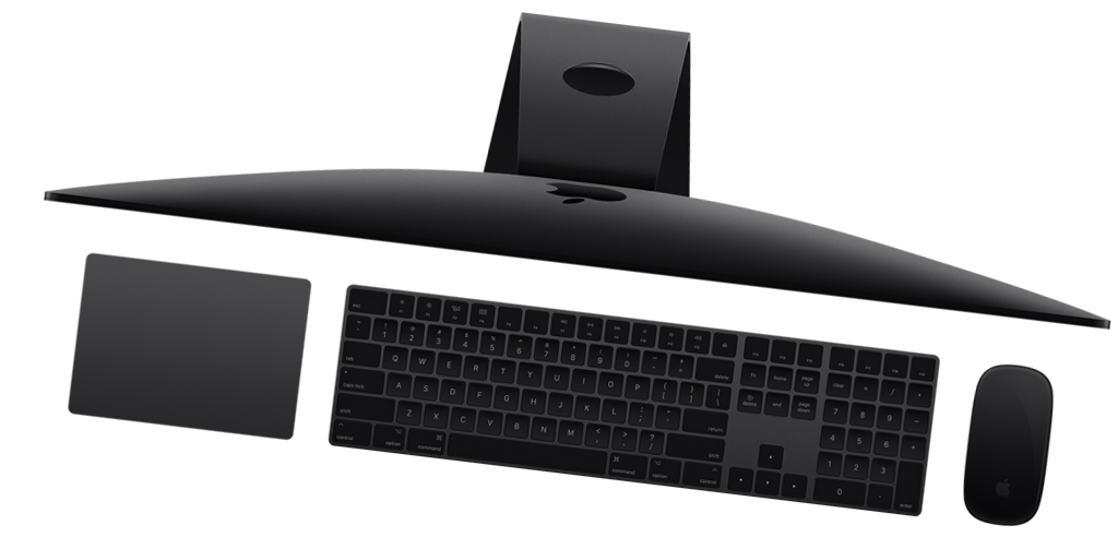
Front-end developer Benjamin Hollway expects more massive background images in 2015, “used alongside rich typography and subtle parallax effects”, largely due to the lead taken by massive brands such as Apple and Google Nexus.
02. Card-based design
Creative director Haraldur Thorleifsson says card-based design will be big: “Content needs to fit on different types and sizes of screen, and cards are the easiest way to make that work across platforms.” He adds this presents a design challenge, since cards can be dull, “but we’re seeing fun, clever takes on this from companies like Google”.
03. Digital-first branding
Clearleft founder Andy Budd (clearleft.com) says “as more companies realise their customers’ primary experience with them is online, we’ll see more digital-first-approaches to branding”. He predicts companies “ditching traditional branding agencies who treat the web with the same care as a branded mug”, instead “commissioning digital agencies to conceive a brand that works first online before filtering down to other channels.”
Ghostly Ferns founder Meg Lewis (darngood.co) adds this may result in “more brands with responsive, fluctuating logos,” which will “force designers to think about a logo from ‘big picture’ to ‘minute detail’ as it scales”.
04. Open data
Sally Jenkinson says open data’s been on the rise, but many digital spaces remain “more closed than ever” and so “leaders such as The Open Data Institute are working to promote more openness”. She reckons this will gain public awareness in 2015, and projects will respond accordingly, in terms of publishing and consumption.
Clearleft’s Andy Parker says we’ll therefore see “more public and private companies making data and content available”. In turn, this will result in “some pretty spectacular services being created, like the Cern sandbox”.
05. Responsive design – evolved
Designer Victor Erixon (minimalt.se) expects the industry to “continue maintaining simple and minimal aesthetics,” with the web “becoming fully customised for different viewports”.
But others see responsive design going further. Jonathan Smiley (jsmiley.me) thinks we’ll see “responsive design practices become more important in native apps,” in part through a proliferation of wearables. “Apple Watch, for example, relies on a responsive-like flow to accommodate a small screen, and so while 2015 isn’t the year the web and native become the same, it’ll get us much closer.”
06. Privacy
Designer Laura Kalbag (laurakalbag.com) says we’ve long “designed for security, so people can trust forms and checkouts with their information”. Now, as people become aware of how data can be exchanged with third parties, “they’ll be reluctant to share it without good reason — and rightly so”.
07. Isomorphic JavaScript

Web design author and practitioner Aaron Gustafson has an alternate take on investment in frontend JavaScript frameworks like Angular and Ember: “Development benefits can be great in terms of speed of development, but there are costs to using this approach. JavaScript is the single biggest point of failure in any web-based product. Unlike on the server side, we do not control the execution of code in the browser.”
He therefore reckons we’ll see more use of isomorphic JavaScript, for companies that have heavily invested in JavaScript for their site infrastructure: “It offers improvements in the areas of performance, SEO, and maintainability to boot. Airbnb and Twitter have moved to this approach. Others will surely follow.”
08. Iteration
Designer Robby Leonardi mulls that perhaps 2015’s big trend will be iteration on what we already have: “We just had trends such as responsive and flat design, and it will take time for another big thing to happen.”
By contrast, he sees enhancements on existing concepts and technologies, with increasingly sophisticated web layouts, better typography, and more designing in the browser.
09. Vibrant design

BaseKit co-founder Richard Healy believes Google’s Material design specification – intended to combine the texture and tactility of paper and ink with the ‘imagination and magic of digital’ – will inspire designers.
He told us: “Think bold, graphical and intentional. We’re talking vibrant, unexpected colours, contrasted with subdued and muted environments; large-scale typography, soft directional lighting and shadow; the use of responsive design best practices; and meaningful motion – carefully choreographed animation that provides fluid, seamless touch transitions and, more importantly, delights users.”
10. Web components meet adaptive design
Developer Aaron T Grogg predicts “web components and adaptive development will combine to create a new style of web development”. Someone will then fashion a “snappy acronym for this approach, which will cause all job ads to now require it”.
By adaptive, Aaron clarifies he means making decisions on the server regarding mark-up to send a user, usually depending on the device being used. “When you combine the power of adaptive development with the flexibility of web components, I think we are going to see very creative solutions from designers and developers.
Hopefully, we will still be creating mobile-first, responsive, one-site-for-all-devices, but making subtle differences will be powerful tools in our toolboxes.”
via Creative Bloq


