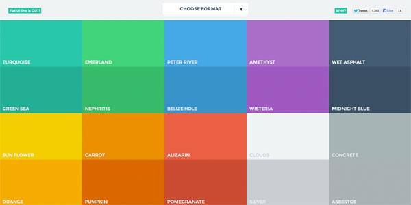
Around one in 10 of your site’s male visitors are colour blind. Dennis Gaebel explains how to make your designs accessible for them.
A little-known fact: colour blindness doesn’t mean a person sees the world without colour: it’s actually a decreased ability to distinguish particular hues from one another. It’s much more common in men than women: around 8-10% of the male population has some sort of colour blindness.
For that reason, colour should not be used as the only means of conveying information, indicating an action, prompting a response, or distinguishing a visual element. In this article, we’ll run through a short list of things designers and developers can do to make websites more accessible to the colour blind.
Making colour accessible
The contrast between text colour and background colour must meet WCAG guidelines. That means text and images of text must have a contrast ratio of at least 4.5:1. Large-scale text must have a contrast ratio of at least 3:1. All other elements like logos and incidental text have no contrast requirements whatsoever. To check, use Lea Verou’s Contrast Checker or try this Sass function.
If the background or the letters vary in relative luminance (or are patterned), the background around the letters can be chosen or shaded so that the letters maintain a 4.5:1 contrast ratio with the area immediately behind them, even if they don’t have that contrast ratio with the entire background.
Around 8-10% of the male population has some sort of colour blindness
Colour association is another factor to consider. People writing ecommerce listings often forget to include terms like ‘fuchsia’ or ‘navy’ in the product descriptions. If you intend to use images for items with colour variations, always reference the name of the colour in the description.
Colour-specific instructions often lead to confusion as well. If someone is asked to perform tasks specifically using colour as a direction, most colour blind individuals will fail.
Instead of relying on colour coding alone for your chart or diagram, use a combination of colour and texture or pattern, along with precise labelling, and reflect this in the key or legend.
For example, if your real estate site provides a bar chart of average housing prices in several regions of the United States, the bars for each region should have different solid colours and different patterns. The legend should use the same colours and patterns to identify each bar.
Visual designers can test colour usage within Photoshop and Illustrator by using the Color Blindness filters, which mimic how your designs look to people with impaired colour vision. These can be found under Views>Proof Setup>Color Blindness>Protanopia-type or Deuteranopia-type.
via Creative Bloq


